Choosing the right colours for a room can significantly enhance the natural light that enters the space, creating an inviting and uplifting atmosphere. Understanding the impact of natural light on colour perception is crucial. Natural light varies throughout the day, influencing how colours appear. For instance, a colour that looks vibrant in the morning sun may appear muted in the afternoon shade. This variability necessitates careful consideration when selecting paint shades to ensure they complement the room’s lighting conditions.
The science behind light reflection and absorption plays a vital role in how colours interact with natural light. Different paint finishes reflect light differently; for example, a satin or eggshell finish reflects more light than a flat finish. This means that using a glossier paint can help to amplify the brightness of a room, making it feel more spacious and airy. In my work as a professional painter, I utilise high-quality airless spray equipment from Graco, which allows for an even application of paint, ensuring that the reflective qualities are maximised across surfaces.
When dealing with dimly lit rooms, choosing lighter shades is essential. Soft whites, pale pastels, and light neutrals can significantly enhance brightness, making the space feel more open and welcoming. In my experience, clients often underestimate the power of light colours. For instance, I recently transformed a small living room by applying a soft cream shade using my Festool dust extraction sander to prepare the surfaces properly, ensuring a flawless finish that maximised the room’s natural light.
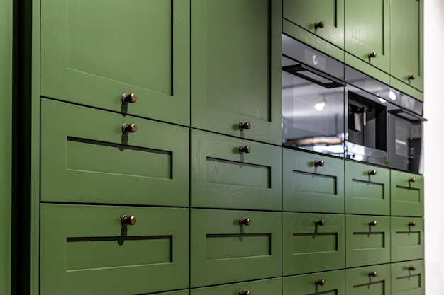
The role of warm vs. cool colours cannot be overlooked when creating a welcoming atmosphere. Warm colours like soft yellows and peach tones can evoke feelings of comfort and warmth, while cool colours such as blues and greens can create a serene environment. The choice between these palettes should align with the intended mood of the room. For example, in a bedroom where relaxation is key, I often recommend cooler tones paired with warm accents to strike a balance.
Utilising accent walls is another effective strategy to balance natural light and colour. An accent wall painted in a bolder hue can draw attention and create depth without overwhelming the space. When I work on such projects, I ensure that the accent colour complements the lighter shades used on the other walls, enhancing the overall aesthetic while still allowing natural light to flow through the room.
Before making a final decision on paint colours, it is crucial to test paint samples in natural light. Paint can look drastically different under artificial lighting compared to daylight. I always advise clients to apply sample patches on their walls and observe them at various times of the day. This practice helps in making informed choices that will ultimately lead to satisfaction with the final result.
Incorporating neutral tones into your colour scheme can create a harmonious environment that works well with various furnishings and decor styles. Neutrals provide a versatile backdrop that allows for flexibility in accessorising and styling. My experience in property maintenance has shown me that clients appreciate how neutral palettes can adapt over time as their tastes evolve.
The effect of colour on mood is another important consideration, especially in relation to natural light. Bright colours can energise a space, while softer hues can promote calmness. Understanding this relationship allows me to tailor my painting services to meet the emotional needs of my clients. For instance, I recently completed a project where we used uplifting yellows in a kitchen to create an energising atmosphere for family gatherings.
Utilising colour theory can also aid in selecting complementary shades that enhance light. By understanding how colours interact with one another, I can create palettes that not only look good but also feel good. For example, pairing a soft blue with crisp white trim can create a fresh and airy feel that maximises natural light.
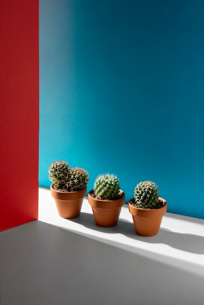
The significance of room orientation should not be underestimated when choosing colours. South-facing rooms receive abundant sunlight, allowing for bolder colour choices, while north-facing rooms may benefit from warmer tones to counteract cooler light. My expertise in painting and decorating enables me to advise clients on how to best utilise their room’s orientation when selecting colours.
When selecting colours, it is also essential to consider how they will work with existing furnishings and decor. A cohesive look can be achieved by choosing shades that complement or contrast effectively with current pieces. My extensive experience in woodworking and carpentry allows me to understand how different materials and finishes interact with colour, ensuring that every element of the room harmonises beautifully.
The benefits of using eco-friendly paints cannot be overstated, particularly concerning health and safety. As someone who prioritises professional safety standards, I always recommend paints that are low in volatile organic compounds (VOCs). These paints not only contribute to better indoor air quality but also align with my commitment to using verified materials certified by UK authorities.
Professional painting techniques are essential for maximising the effect of chosen colours. Using advanced tools like my Graco airless spray system ensures an even application that enhances the vibrancy of colours while reducing overspray and waste. This level of precision is crucial for achieving a high-quality finish that truly reflects the beauty of the selected palette.
Proper ventilation during painting is another critical aspect of ensuring a safe environment. I always ensure that spaces are well-ventilated during my projects to minimise any potential health risks associated with paint fumes. This practice not only protects my health but also ensures that clients can enjoy their newly painted spaces without concern.
Finally, showcasing case studies of successful projects where colour was used effectively to enhance natural light can inspire potential clients. For instance, I recently completed a project in Telford where we transformed a dark hallway by using light grey tones combined with strategic lighting solutions. The result was a bright and welcoming entryway that made an impressive first impression.
If you’re considering enhancing your space with colours that maximise natural light, don’t hesitate to reach out! You can message me directly on WhatsApp at 07728868401 for personalised advice and professional painting services tailored to your needs.